The impetus for my creative burst over the past year was a desire to paint abstract acrylics.
Today I feel like there has been progress made to this end.
Through this journey, I have learned a lot, created a lot and found so much more than I ever expected. Mainly, that watercolors are a hell of a lot more forgiving than acrylics!
Undaunted, well completely daunted, A.D. noticed a couple of things and gave me some feedback: I was struggling with composition and I wasn’t getting the depth I wanted. He suggested that I ‘art school’ myself and do some studies of other artists who had what I wanted so that I could better learn how to achieve my artistic goals; once you get the technique, you can apply your ideas.
I was further spurred in this direction after watching a Mary Doodles video on YouTube. Same advice. Find something that you like and practice. And practice.
The Transformation:
This is what I started with. It was a painting gone awry. You can see the errors and moreover, it doesn’t feel right.
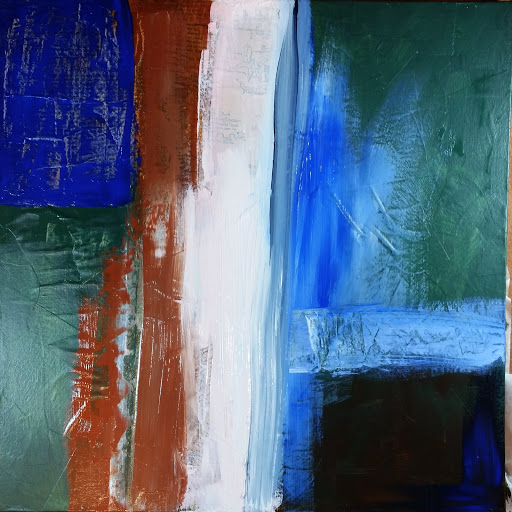
I promptly used gesso to cover the entire painting so I could start over. I then underpainted with the basic shape of my finished work, an ‘L’ shape.

After this section dried, I felt like there wasn’t enough texture, so I used a palate knife and some string gel to put whorls and swirls about the canvas. I then used a spatula to mix and added some warm colors with either crackle paste or fiber paste mixed in to matte it up. I was pretty pleased at this point, but knew I wasn’t done yet.
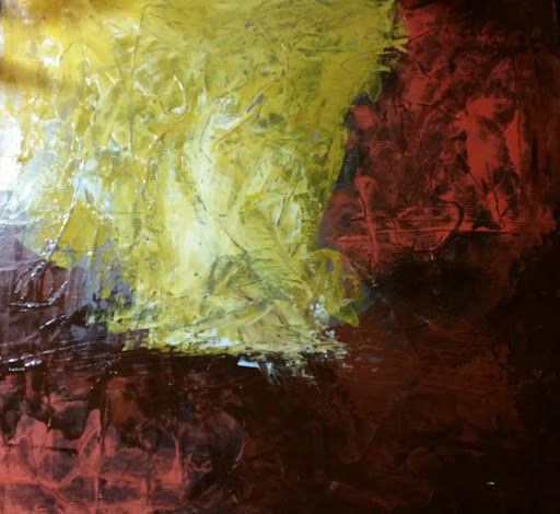
I let this dry completely again and realized that I needed a pop of color, something to pick up the ochre and sienna colors and add some contrast. I also wanted to incorporate some techniques I picked up watching Paul Dranitsin on YouTube.
I really got a little wild with the alizarin crimson, but by this time, I felt empowered that I could tone it down in the next layer. I used the wiper technique from Dranitsin to get the black to ‘melt’ into the other areas. After this layer dried thoroughly, I laid down some painter’s tape about 1/3 the way up the canvas as I knew I wanted to add teal. So many of the paintings I return to over and over again are a color scheme of red, gold and teal. Love it.
I just love that line. It is a blend of a green and teal paint with fiber paste for texture and matte finish. After I let this dry thoroughly, I made a mix of Burnt Sienna and Lamp Black with matte medium and used a spray bottle to wet the canvas. I applied the darkened sienna to the canvas and wiped using a wet paper towel. This gave the effect of popping out the texture and blending some of the edges. Next, I mixed some Lamp Black with a touch of Raw Sienna and fiber paste and applied at the ends of the teal line. I also added some Raw Sienna to Titanium White and went through a lot of adding and wiping away before I got the look I liked.
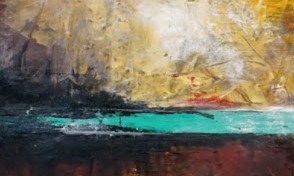
The title, Hot Springs, is what the end product reminds me of as it seems to be a clear pool in the landscape with steam rising in the cool night.
Or maybe I’m just making it all up 😉
Hope you enjoyed and let me know what you think!
